Figura MPS is a geometric sans-serif based on Tia Lira, a Portuguese typeface designed by Manuel Pereira da Silva. It uses a x-height variation to reinterpret the modular-like shapes of the caps-only original font, with its rich alternate characters. Figura MPS revives the experimental geometry of Tia Lira, bringing it to a more contemporary and versatile context, while keeping its most outstanding features, through the interpolation of its variable axis.
Manuel Pereira da Silva
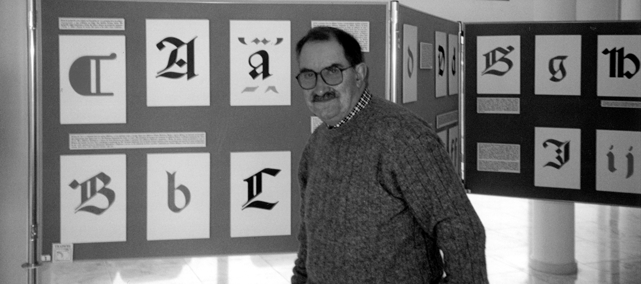
Figure 1 – Manuel Pereira da Silva presenting his letter drawings on exhibition panels, Póvoa de Varzim, 1997. (Source: Ferreira, Antero. (2009). Manuel R. Pereira da Silva (Póvoa de Varzim, 1930–Lisboa, 2008): O tipógrafo português completo. GFM. Grafema.)
Tia Lira's author, Manuel Pereira da Silva (1930–2008), was a Portuguese designer, typographer, and a researcher with significant contributions to the national typography scene. Despite previous dissemination efforts, his contributions remain little recognized in both national and international spheres.
He showed a great awareness for the integration of new technologies in his work, having pioneered the adoption of digital technologies in type setting—something still under-explored in the Portuguese graphic context, at the time. He left a legacy of great relevance for the history and practice of type design in Portugal.
Manuel Pereira da Silva focused on the practice of type design in a more consistent manner in a later stage of his career, even though it accompanied him all throughout his life. He designed a vast catalogue of typefaces and type families based on historic sources with connections to the Portuguese heritage, like Rotunda, Barata, MBarata, Andrade, JVentura, and others.
Tia Lira
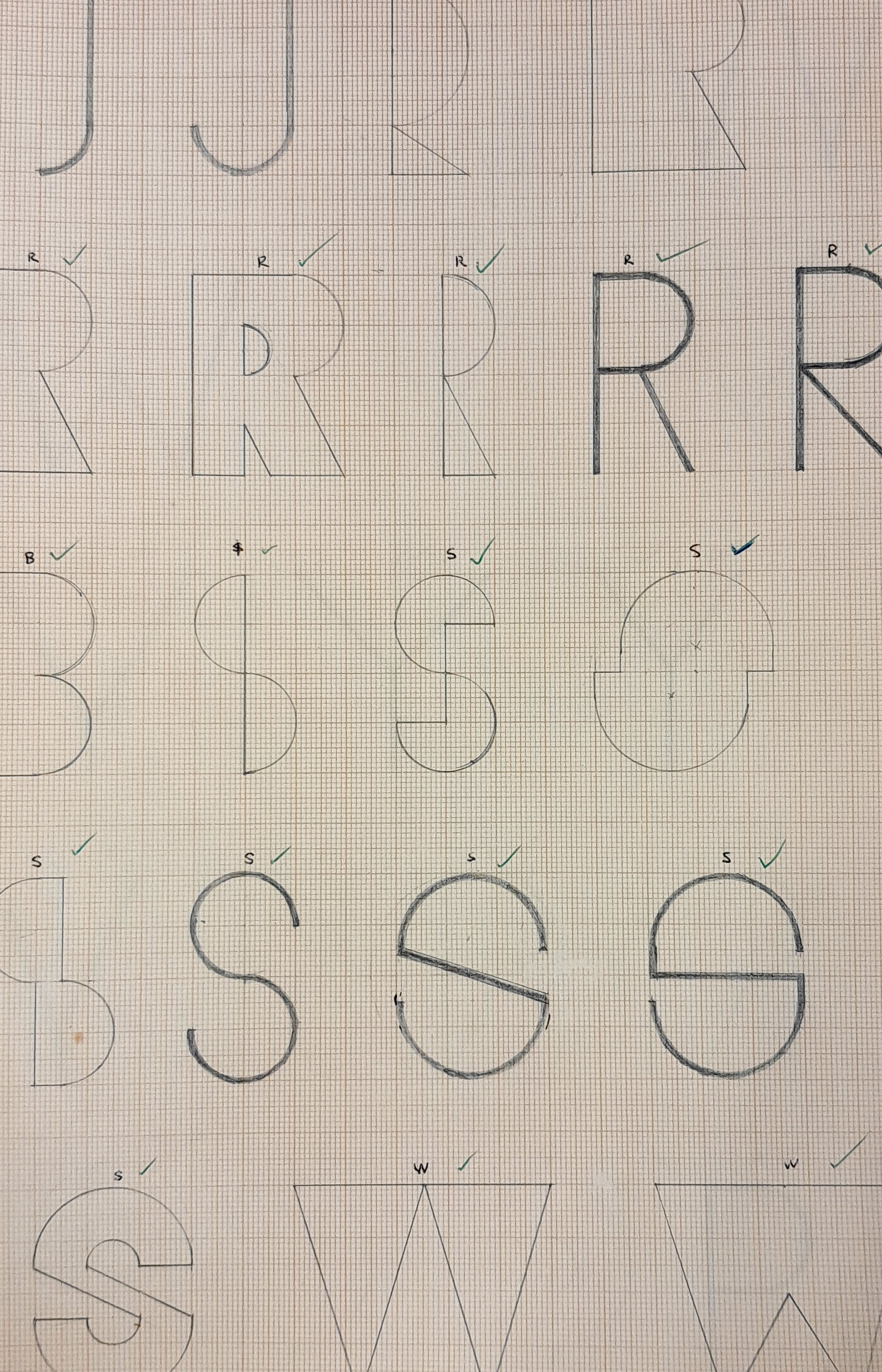
Figure 2 – Tia Lira's original sketches, photographed at the archive of the Rocha Peixoto Municipal Library in Póvoa do Varzim—the hometown of Manuel Pereira da Silva.
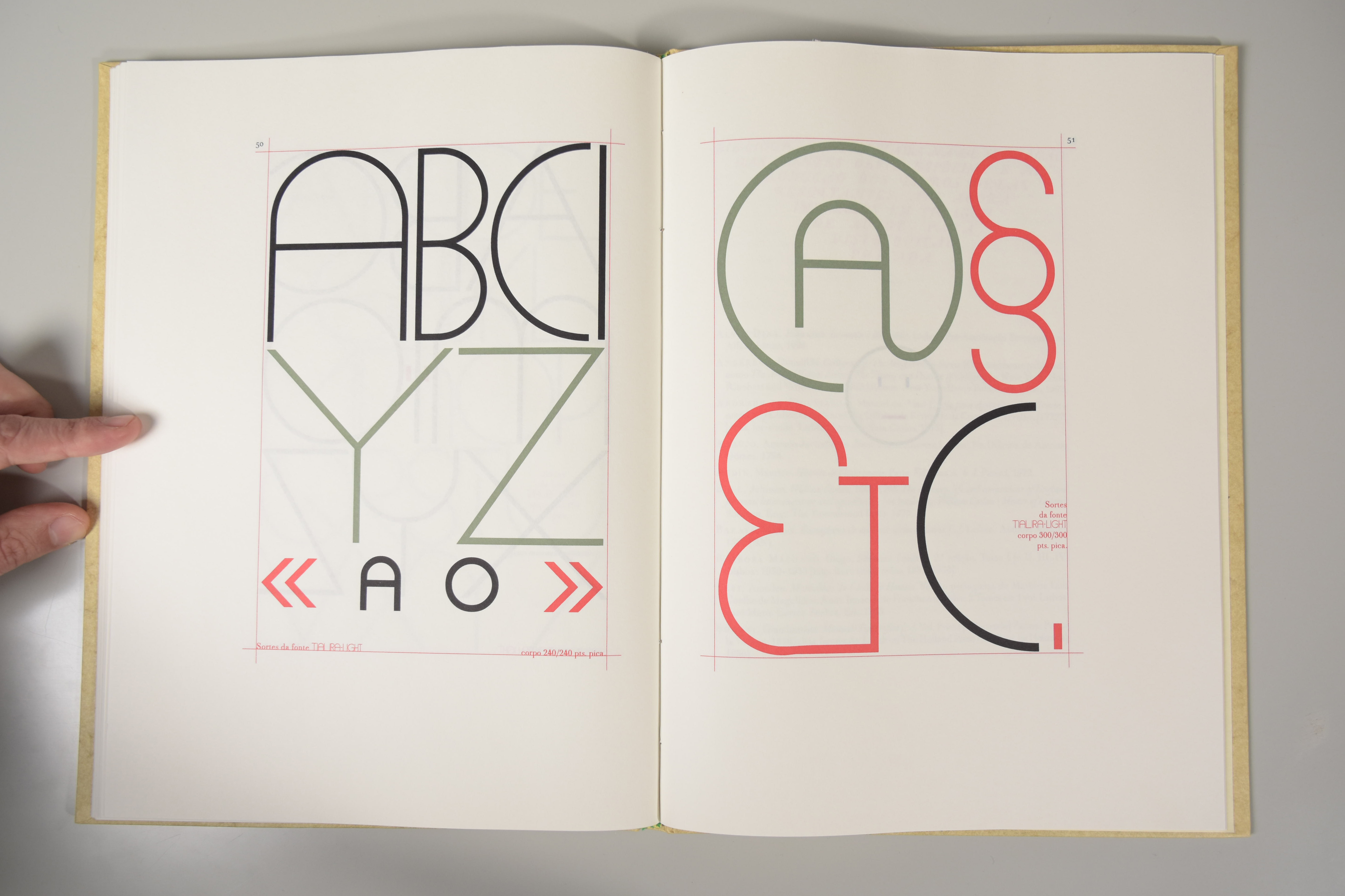
Figure 3 – Spread of the "Specimen of digital typefaces", showcasing Tia Lira. (Photo credits: Vítor Quelhas).
Only two of Manuel Pereira da Silva's typefaces were not type revivals, one of them being Tia Lira.
He began developing this font in 1965 with some manual sketches drawn over millimetric paper. Tia Lira has five weights, contains only capital letters with experimental shapes; they have mathematically geometrical proportions, and a noticeable amount of alternates which makes its overall feeling particularly rich.
The name "Tia Lira" is a direct tribute to the author's grandmother, known within the family as "Ti'Lira." This personal reference introduces an emotional and memorial dimension to this typographic project.
The design was later converted into digital fonts by the author in 2002–2003—almost 40 years after the first sketches. Tia Lira was used by the author in several of his design projects, but was never published or made available for general use.
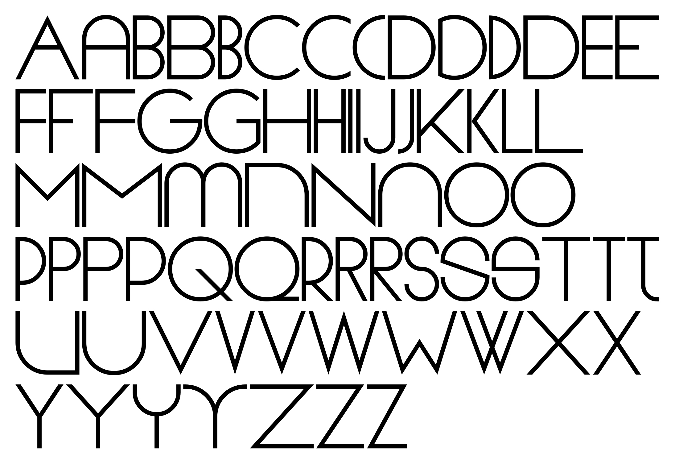
Figure 4 – Main character set of Tia Lira in the Normal weight, displaying its many alternates.
A process in three acts
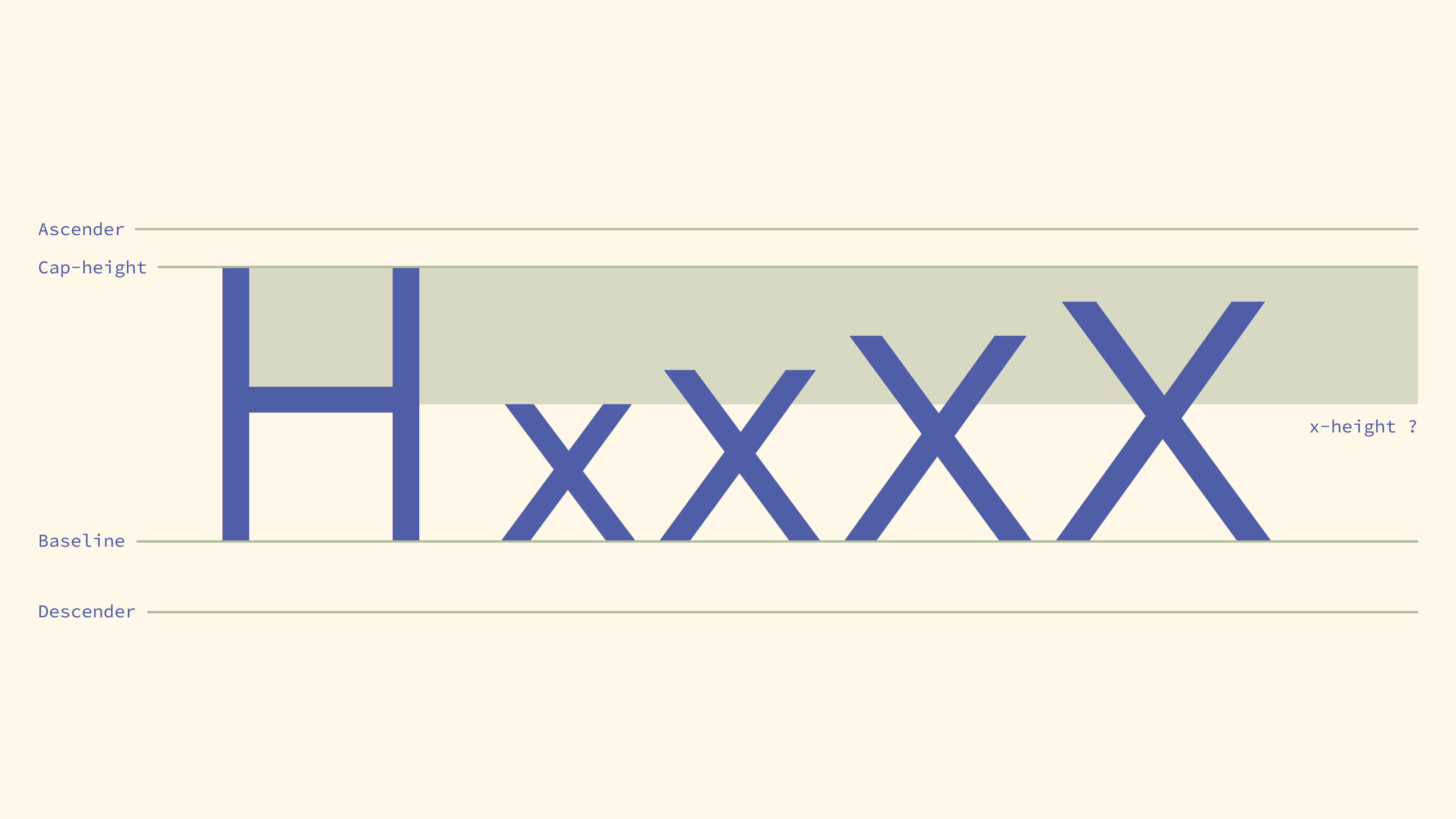
Figure 5 – Visualization of possible x-height variations.
Because it was important for this typeface to have a broader use than its reference, small letters were included. And so, the question of where to put the x-height came about.
A pool of case studies regarding typefaces in the same category of Tia Lira—geometric sans-serifs—, drawn attention to the fact that they tend to have historical tendencies and differences regarding the x-height, over time: in earlier cases—as in Jakob Erbar's Erbar-Grotesk (1926), and Paul Renner's Futura (1927)—, the x-height tends to be lower, and later in the 20th century—as in Herb Lubalin's ATC Avant-Garde (1970)—and contemporarily, it tends to be higher.
Ultimately, Figura MPS approaches this decision in a broader manner, defining a variable x-height axis, allowing it to represent different eras of this genre.
The decision of having a variable x-height showed a lot of promise visually, but it also brought some challenges that revealed the need to make some optical adjustments to the capital letters, specially in their width: in instances where the x-height is lower, capital letters were made narrower; and where it is higher, capital letters were made wider.
This guaranteed a harmony in the size and optical weight between capital and small letters, all throughout the interpolation.
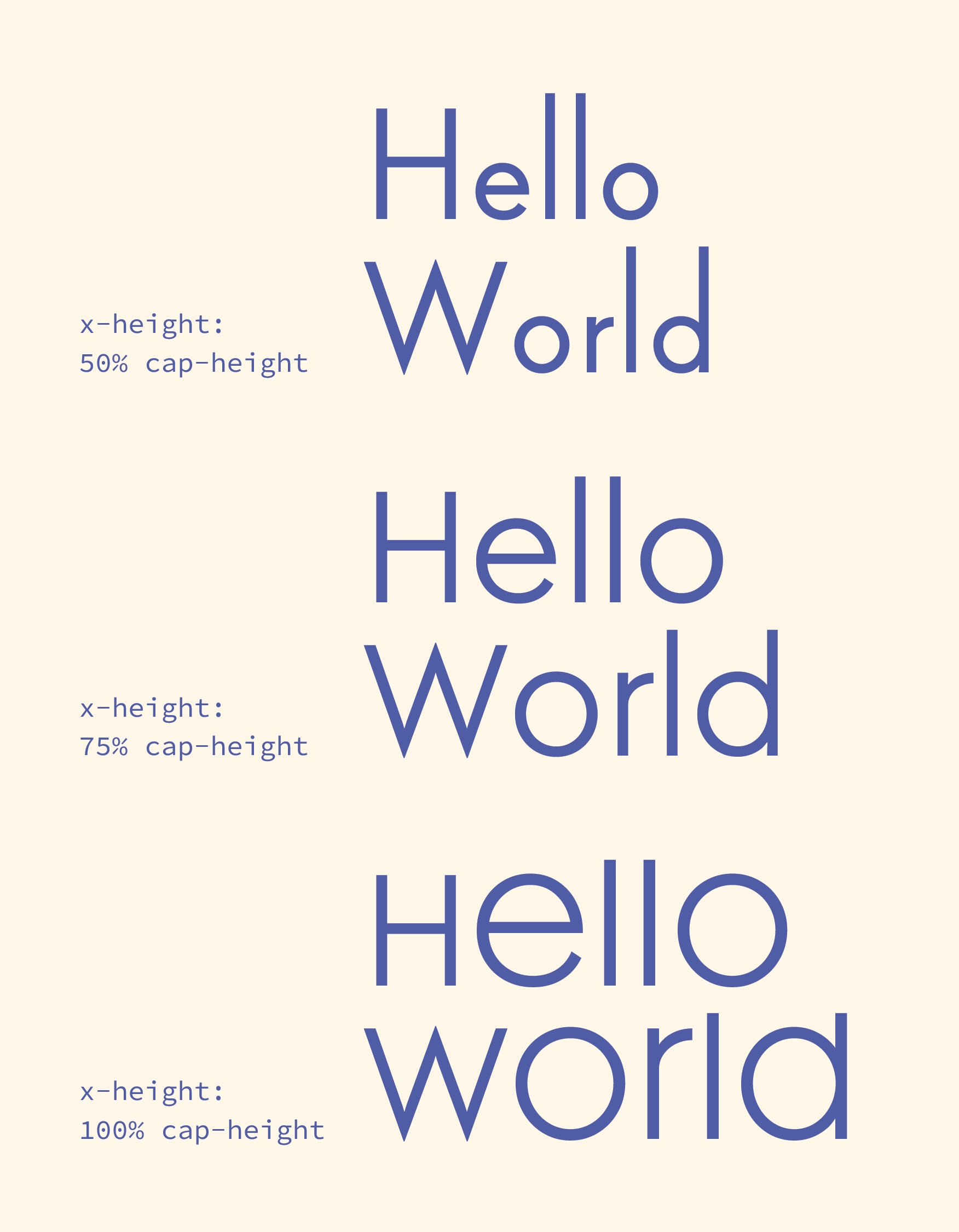
Figure 6 – Three masters of the x-height variation axis before the optical compensations to the width of capitals.
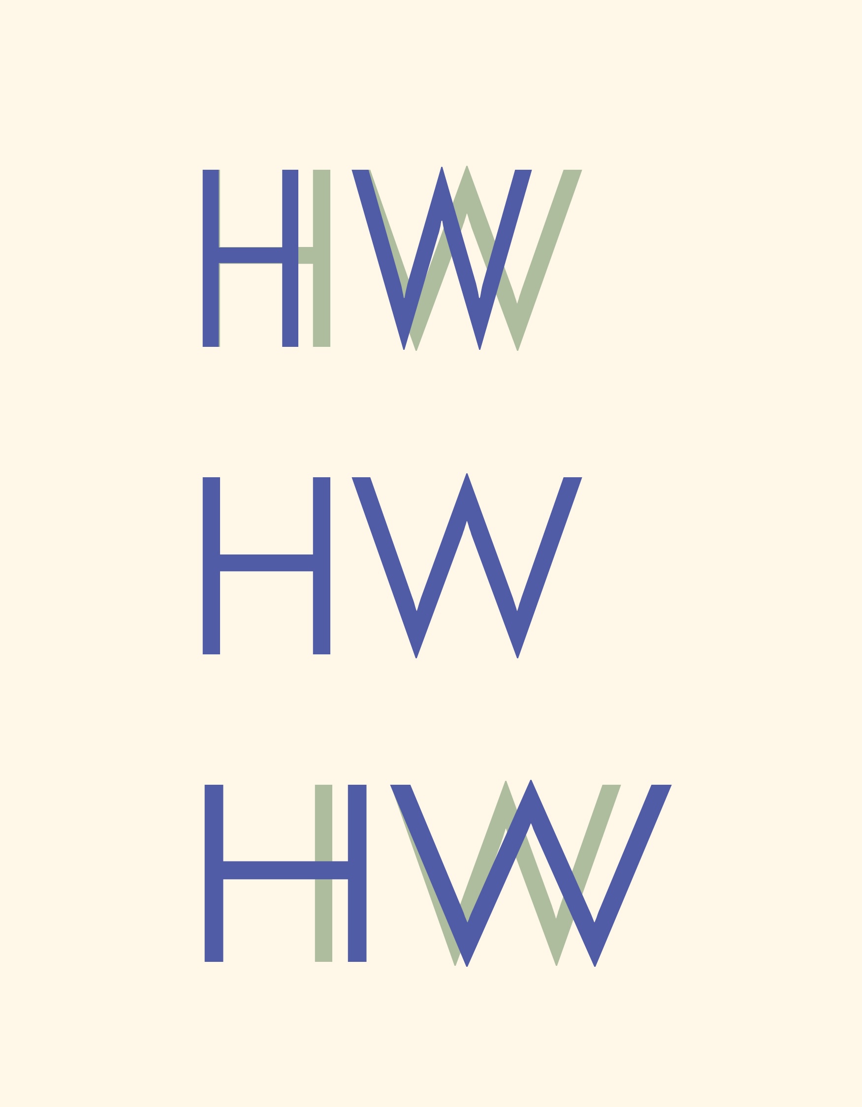
Figure 7 – Optical compensations to the width of capitals in the extremes of the x-height interpolation.
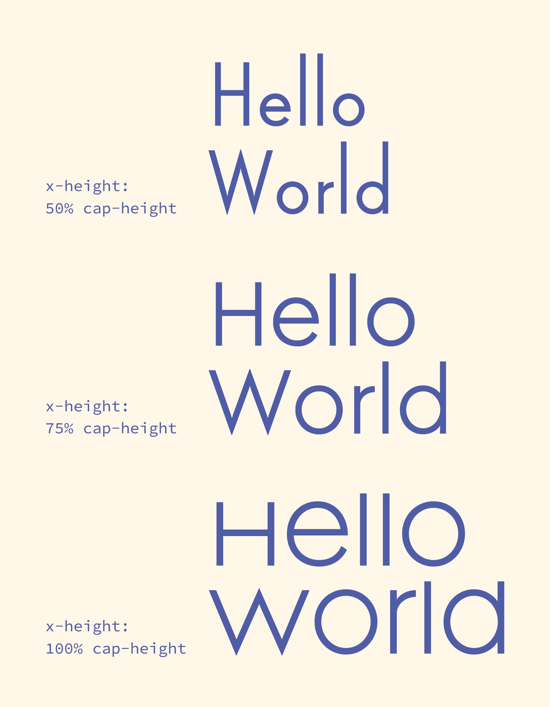
Figure 8 – Three masters of the x-height variation axis after the optical compensations to the width of capitals.
Taking advantage of this variation of the x-height, although it was not intentional in a first stage of the project, made it possible to represent a high quantity of letter designs present in the original typeface, not as alternates but within a single glyph.
The type revival
The result of this process is Figura MPS. The name Figura is a reference to the geometric shapes of Tia Lira, and MPS are the initials of Manuel Pereira da Silva, as a tribute to the author.
This type revival keeps the more impactful features of Tia Lira while making it more contemporary and versatile.
Figura MPS has four default instances, each one of them with a different x-height—from 50% the cap-height to 100% the cap-height. The variable capacity of the font allows the user to also select intermediate values of the interpolation. It also brings motion experimentation to the table.
The development of Figura MPS aims to contribute to the visibility and understanding of Manuel Pereira da Silva's typographic heritage. The reinterpretation of Tia Lira promotes an approach to the practice of type revival that relies on the interpolation of variable font axes to reach a conceptually, technically, and methodologically sound result.
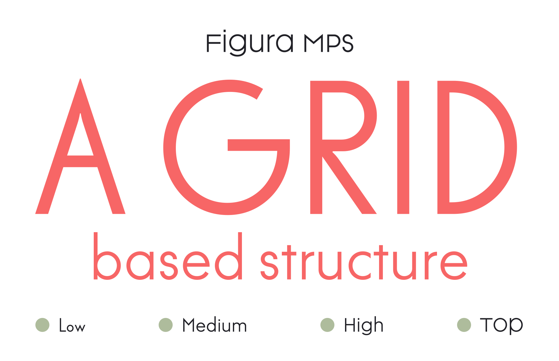
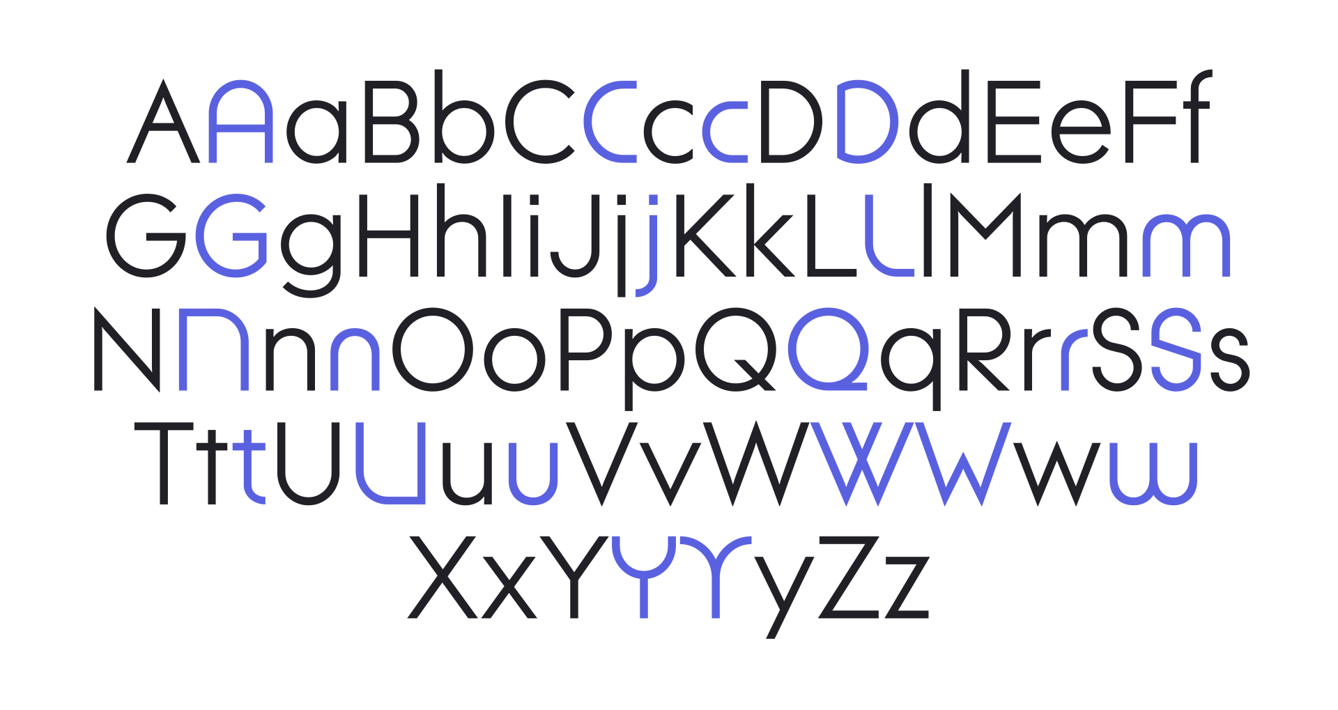
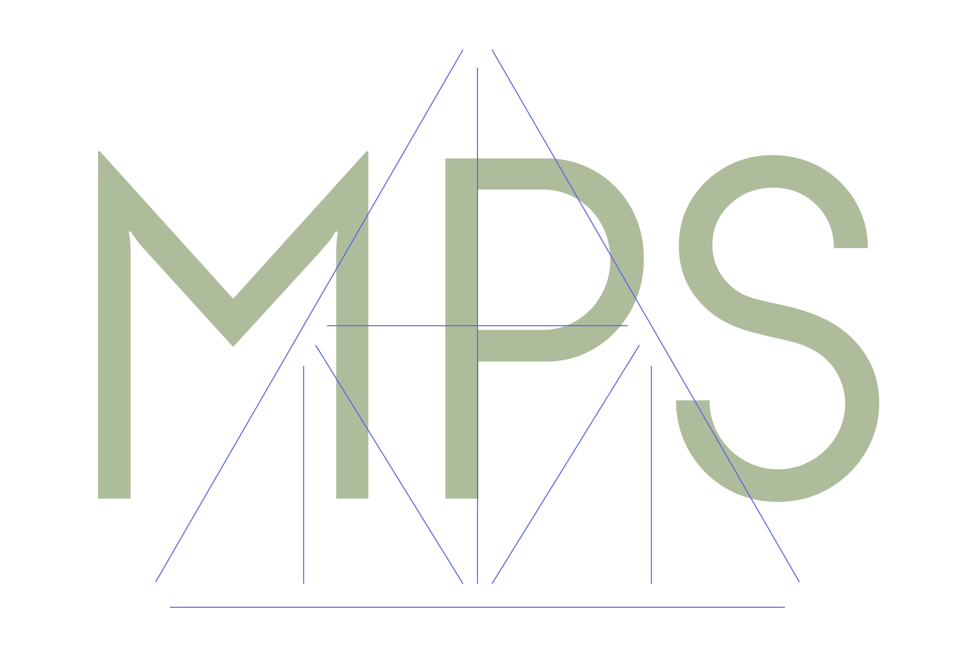
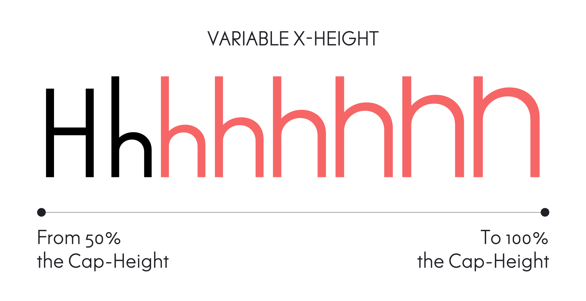


Figura MPS is a typeface designed within the scope of a Master's Degree project—The revival of Tia Lira—at the Faculty of Fine Arts of the University of Porto, under the supervision of Pedro Amado and Vítor Quelhas. It is still under development, with kerning pairs, a weight axis, italics, and much more to be added.
If you would like to know more about Figura MPS or the project The revival of Tia Lira, a thoughtful email will do the trick.